Product: Global Connect
Role: UX Designer, Research, Visuals, Interaction
Duration: November 2022 - December 2022
%201%20(1).png)


Global Connect is a job search service mobile app and responsive website that strives to aid first-generation immigrants and job seekers by optimizing their user experience with resume and skill preparation, efficient and accessible navigation, and guided help throughout the user journey. Global Connect targets users who have difficulty with job hunting and want the process to be simplified with guidance, straightforward signup, an efficient way to view jobs, help with knowing which jobs are the best fitting, and a simple way to track their application. Global connect will be created with features that will stand out and provide the solution for our user's pain points while prioritizing accessibility, efficiency, and a successful user journey.
Design a job search service mobile app and a responsive website that provides easy navigation, guidance, efficiency, and a good user experience that enables the user to job hunt with confidence, efficiently job search, and reach their desired goals.
The Goal
Let's Begin
Through extensive research, interviews, empathy maps, and thorough observation, I came to understand the user's needs, goals, and pain points. The user group identified first-generation immigrants, immigrants, job seekers, adults of different genders, elders, and, users with visual impairments who need help with job search efficiency, guidance in successfully completing the user's task, and resume/skill insights. In this process, easy navigation, a simple signup process, and ensuring the user journey was intuitive were prioritized.
This research confirmed assumptions about difficulties users have while navigating and completing their different goals on the site. To reveal these pain points key interview questions were asked.

What's your experience using a job search service site/app?
How do those challenges affect you?
What device do you normally use to job search, and why?
What challenges have you faced?
Is there a way these challenges could be resolved?
Project Vision
Pain Points
Guidance/Navigation
Users can be left confused and frustrated when going through a multiple step process with out the proper guidance.
Resources
The job hunting experience can be worsened if users don't have the insights and resources that will help them in the process.
Efficiency
People can have difficulties with not having quick and easy access to viewing certain content when they're on the go or simply browsing.
Complexity
The user journey can become frustrating for users if there is too much complexity introduced, such as complicated signup pages and navigation.
The Users


Competitive Audit
After looking at potential direct and indirect competitors I found the majority of their features to be similar or vary in different ways, however, through research, I realized there was still room for improvement which this website has the space to capitalize on.
Gaps
Two of the competitors don't have a job search engine.
Three of the competitors need a better contrast ratio
One of the competitors lacks descriptive info and could provide more resources.
Sitemaps
I constructed a hierarchical sitemap to get a clear organizational path on the main user flow from start to finish. This helped to understand the user's experience with navigation and how they might interact with the product.

Paper Wireframes
Here I did rough sketches on paper, prioritizing the flow, layout, and a number of elements that best address the user pain points. Around the side I jotted down ideas that I felt could be added to the future mockup.


Low Fidelity Prototype
After sketching out paper wireframes and understanding the user's needs to be met, I moved forward to the digital aspect and revised what areas were important, and looked over the user flow and interactions before spending time on the visuals.

Digital Wireframes

As the design phase continued, I made sure to implement the screen designs based on the pain points and priorities that needed to met for the user.
As simplified signup page that provides straightforward input information, descriptive guidance, along with icons to aid the user in their process.
Resume suggestions and score with descriptive information to help with insights and suggestions on bettering the status of your resume. Along with informative navigation at the top.

.png)
Quick view feature that provides efficiency with easy viewing of the job posting when on the go or simply browsing.
Resource pages that provide insights to job seekers to help with their job hunting journey
.png)
Usability Studies 1
After designing the low fidelity prototype I asked participants to go through the main user flow while I assess their experience with questions and a questionnaire (system usability scale). Then I received feedback that was taken into consideration to develop the high fidelity prototype.
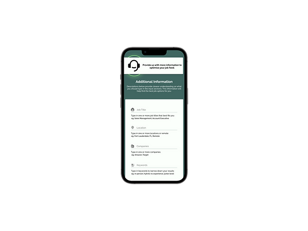
Users had difficulty understanding the purpose of the additional information page
eg. of feedback developed into prototype
Users didn't understand the purpose of quick view
eg. of feedback developed into prototype
.png)
.png)
.png)


Usability Studies 2
After designing the high fidelity prototype I asked participants to go through the main user flow while I assess their experience with questions and a questionnaire (system usability scale). Then I received feedback that was taken into consideration to edit the design of the prototype.
Users wanted the responsibilities under the job posting to highlighted
Users didn't see a purpose for some of the menu buttons on certain pages based on context and their importance of usage
The pop-up style for information on the additional information page can be overwhelming
eg. of feedback developed into prototype
eg. of feedback developed into prototype
.png)
.png)
.png)
.png)
Style Guide
Global Connect's color scheme provides a symbol of growth, allowing an inviting interface that provides a calming feeling. The greens capture the feeling of new growth and success and allow the user to feel a sense of encouragement while moving through the user journey.
Colors

Buttons

Fonts


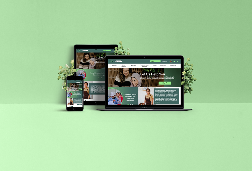

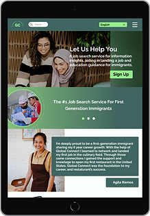
Responsive Website
After the dedicated mobile app was completed, I began the process of creating a responsive website for Global Connect on three different devices (Macbook, Ipad, iPhone). Beginning from designing the smallest device size to the largest, I kept the purpose of the dedicated mobile app in mind while creating the paper wireframes to ensure there was a user-centered design being kept every step of the way. The responsive website will be beneficial for a larger set of users as it eliminates issues regarding access on different types of devices and promotes efficiency,

.png)
Key Takeaways
Global Connect is a project I have great pride in as it confronts a social issue that I believe is impactful in this world, helping first-generation immigrants in the search for their careers. Social good projects not only center the user as the focus of the design but stress the impactful importance of having a sufficient interface to aid the user in completing their journey and making their life easier. This was a professional concept that had positive responses from my participants from the impressive navigation, impactful features, and accessible driven layouts. Designing a responsive website showed how differently individuals interact with different devices and how strongly their experience can be impacted. Moving forward my next step is to further my research study with a wider variety of participants and consider other possibilities or difficulties that could've been looked over. I'm proud of making impactful work and will continue to work on it.