Product: The Lens Project
Role: UX Designer, Research, Visuals, Interaction
Duration: September 2022 - October 2022


The Lens Project is a photography social networking website that strives to optimize the user experience with straightforward, easy, and accessible website navigation, personalized generated feeds created by a photography-based questionnaire to adapt the web experience to the user's experience level, and comfortability, Inspiration, Group, and Community pages to encourage regular interaction with other users while aiding novice photographers in their journey, and additional chat prompts that helps users complete their task in networking and growing connections in the photography community. The Lens Project targets users who have different experience levels in photography and want a platform to easily network, users who view photography as a hobby and want easy access to resources, inspiration, and ways to grow their hobby, and users who have no experience or knowledge in the field but are still interested in exploring the site. Through these features, different types of users can easily navigate and have a positive experience regardless of their experience level.
Design a photography social networking website that creates a personalized feed, easy navigation, and a good user experience that encourages while easily allowing the user to connect, become inspired, and reach their goals
The Goal

Let's Begin
Through extensive research, interviews, empathy maps, and thorough observation, I came to understand the user's needs, goals, and pain points. The user group identified were adults of different ages, students, and elders who had various levels of interest in photography and social networking while wanting an easy way to network, and be inspired. In this process, easy navigation, encouraging network, and ensuring the feeds of each page were prioritized.
This research confirmed assumptions about difficulties user's have while navigating and completing their different goals on the site. To reveal these pain points key interview questions were asked.
How often do you use social networking sites?
How do those challenges affect you when attempting to purchase?
In what ways does the navigation and the layout of the site affect your experience?
Is there a way these challenges could be resolved?
What challenges do you face when purchasing a movie ticket through an app?
Project Vision
Pain Points
Layout/Navigation
A bad experience is created when the layout/navigation is overwhelming or too complex
Resources
Experiences are made difficult for novice users if they don't have access to inspiring content or resources to aid them in their journey
Networking
People can have difficulties with knowing how to network and chat with others
Beneficial
Social networking websites not specifically catered to photography can cause photographers to come across difficulty connecting with people in their specific niche or completing goals related to their craft
The Users


Competitive Audit
After looking at potential direct and indirect competitors I found the majority of their features to be similar or vary in different ways, however, through research, I realized there was still room for improvement which this website has the space to capitalize on.
Gaps
Three of the competitors could provide more consideration of accessibility features in their design
Three of the competitors provide the possibility of the user being overwhelmed with the amount of content on screen at one time
There was a struggle with navigation with two of the competitor’s sites
Sitemaps
I constructed a hierarchical sitemap to get a clear organizational path on the main user flow from start to finish. This helped to understand the user's experience with navigation and how they might interact with the product.

Paper Wireframes
Here I did rough sketches of the homepage on paper, prioritizing the flow, layout, and a number of elements that best address the user pain points. Around the side I jotted down ideas that I felt could be added to the future mockup.

Low Fidelity Prototype
After sketching out paper wireframes and understanding the user's needs to be met, I moved forward to the digital aspect and revised what areas were important, and looked over the user flow and interactions before spending time on the visuals.

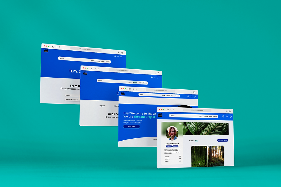
Digital Wireframes
As the design phase continued, I made sure to implement the screen designs based on the pain points and priorities that needed to met for the user.

An organized simplified layout that prioritizes the search bar, navigation menu, and simplifies the amount of information given at one time.
Chat prompts to guide the users into make conversation and connecting with other users to build their network.
.png)
A community with resources to aid other users with tips and insights

.png)
Inspiration page organised by time periods and the trends during those times
Usability Studies 1
After designing the low fidelity prototype I asked participants to go through the main user flow while I assess their experience with questions and a questionnaire (system usability scale). Then I received feedback that was taken into consideration to develop the high fidelity prototype.
Users wanted more questions to personalised their feed based on their preference.
Users wanted to be able to send a friend request from within the chat.
Users wanted categories in the Inspiration and Explore pages
eg. of feedback developed into prototype

_edited.png)

Usability Studies 2
After designing the high fidelity prototype I asked participants to go through the main user flow while I assess their experience with questions and a questionnaire (system usability scale). Then I received feedback that was taken into consideration to edit the design of the prototype.
Users had a hard time going back to the home page from the chat
eg. of feedback developed into prototype
Style Guide
The Lens Project's vibrant color scheme provides a visually engaging and inviting interface. The blues capture the feeling of stability and reliability and allows the user to feel a sense of security and the brighter blue keeps the visuals interesting, welcoming and fun to keep the user visually stimulated.
Colors

Buttons

Fonts

_edited.png)
_edited.png)

Key Takeaways
With the great success and positive responses from my participants at the end of the second usability study my next step is to further my research study with a wider variety of participants. This design process has allowed me to freely express my design skills while maintaining the user's priorities with the design. I am proud of the work I am doing and will continue to on this project.