

_edited.png)
Product: Cinemagic
Role: UX Designer, Research, Visuals, Interaction
Duration: February 2022 - June 2022
.png)
_edited.png)
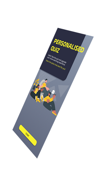
Cinemagic is a movie ticketing app that strives to optimise the user experience with straightforward app navigation, personalised quizzes that make the purchasing experience unique and personable to each user, and a point system feature that promotes users saving money. Cinemagic targets users who either are regular movie watchers that would like to save time making better movie selections or users who are not regulars and would appreciate guidance in their movie selection. Through these features the user can be guided while saving time and money.
Design a movie ticketing app that creates a personalized purchasing experience to promote saving time, money and a good user experience.
The Goal
Let's Begin


Through extensive research, interviews, empathy maps and thorough observation, I came to understand the user's needs, goals, and pain points. The user group identified were working adults at different ages and stages in their lives who prioritized money and time in regard to purchasing movie tickets.
This research confirmed assumptions about cost/savings and also brought light to difficulties with choosing a movie and shortening search time. To reveal these pain points key interview questions were asked.
How often do you watch movies?
How do those challenges affect you when attempting to purchase?
How often do you order movie tickets through an app?
Is there a way these challenges could be resolved?
What challenges do you face when purchasing a movie ticket through an app?
Project Vision

Pain Points
Time
A lot of time can be lost by spending hours searching to find one movie.
Preferences
Time wasted watching bad movie choices because the movie suggestions weren’t built around the user’s personal preference.
Money
Not everyone is aware of the money that can be saved based on deals or discounts when purchasing a ticket
Family
When time and money aren’t balanced for the working adult then the option of purchasing tickets for the family can turn into a financial issue.
The Users


Competitive Audit
After looking at potential direct and indirect competitors I found the majority of their features to be similar, however, through research, I realized there was still room for improvement which this app has the space to capitalize on.
Gaps
The competitor provides no accessibility feature or they were difficult to locate/identify.
Competitor apps don’t ask about language preferences.
Some layouts can be underwhelming or overwhelming.
User Flow Journey
I constructed a basic user flow from start to finish. This helped to understand the user's experience with navigation and how they might interact with the product.

Paper Wireframes
Here I did rough sketches of each screen of the app on paper, prioritizing the elements that would be best fit to address user pain point and ensuring those made it to digital wireframes. Around the side I jotted down ideas that I felt could be added in the future mockup.

Low Fidelity Prototype
After sketching out paper wireframes and understanding the user's needs to be met, I moved forward to the digital aspect and revised what areas were important, and looked over the user flow and interactions before spending time on the visuals.

Digital Wireframes
As the design phase continued, I made sure to implement the screen designs based on the pain points and priorities that needed to met for the user.
A personalized movie section to guide the users into a catered experience to them and a having better movie selection choices that fit their likes to save time and money.


Including an all movies option to allow users the freedom to explore other movies
Saving money was a priority for the users which I addressed by implementing a point system and a section to display discounts. Money-saving options may be available otherwise but most apps do not readily show to you.

A point system to save money.
Potential discount codes for the site displayed openly.
Usability Studies 1
After designing the low fidelity prototype I asked participants to go through the main user flow while I assess their experience with questions and a questionnaire (system usability scale). Then I received feedback that was taken into consideration to develop the high fidelity prototype.
Users want a clearer understanding of how to create an account.
Users want more features and information in the app
Users want more options in the personalized quiz
eg. of feedback developed into prototype
.png)
.png)

Usability Studies 2
After designing the high fidelity prototype I asked participants to go through the main user flow while I assess their experience with questions and a questionnaire (system usability scale). Then I received feedback that was taken into consideration to edit the design of the prototype.
Users had a hard time finding the navigation button
Users don’t see the purpose of the save progress section
eg. of feedback developed into prototype
Style Guide
Cinemagic's signature highly contrasting color scheme provides a visually engaging and inviting interface. The darker colors captures the concept of a movie experience and the brighter colors come off as bright and welcoming.
Colors


Buttons


17pt, Regular
20pt, Medium
24pt, SemiBold
24pt, Bold

Fonts

15pt, regular
20pt, regular
24pt, regular
32pt, regular


Key Takeaways
The Cinemagic project is dear to me as it represents the beginning of my UX career, as a movie enthusiast it was a great opportunity to express myself and design this interface. The designed process taught me how many modifications may be needed based on the various needs different users have and learning to be comfortable with constantly revising your product. Furthermore, I plan to continue with further research studies and include participants who have different stories to see if there are new and unknown areas I could improve on.